PALIMPSETS IN PONTE CITY
PALIMPSETS IN PONTE CITY

Palimpsests in Ponte City
Emblematic of South Africa’s failed apartheid-era dreams, Ponte City is a 54-storey block of flats in Johannesburg, initially designed as an urban space of white privilege, luxury and global aspirations. Built in 1975, Ponte is an iconic Brutalist-style landmark recognisable throughout the city due to its great height, unusual cylindrical shape and bright Vodapay sign that wraps around the tower’s topmost floors. Located in the neighbourhood of Berea, a historically “white group area”, populations of colour could not legally enter without a dompas (“passbook”) that validated them to travel, work or live in the city. National economic downturn and the political instability that followed the 1976 Soweto Uprising led to inner-city desegregation, first by Coloured ¹ and Indian residents, then by Black residents after the former were forcibly displaced to other townships. Following the nation’s second State of Emergency, increased “white flight” transformed the inner city into a majority Black space by 1987.
White South Africans perceived this racial tipping point to be the driving force for urban degradation and mayhem. Located in what is now considered one of Johannesburg’s most dangerous urban zones, Ponte gained a reputation for housing socially-deviant populations of shifting order. During apartheid, Coloured, Indian and Black South Africans were disenfranchised and oppressed. After democratic transition in 1994, African foreign nationals became the new targets as they moved to Johannesburg seeking better economic opportunities. Despite widespread Pan-African support during apartheid, the 1990s saw rising xenophobic violence against African foreign nationals. During this period, Ponte’s core allegedly housed up to 14 storeys of litter. Though the rubbish piles were cleared out by the early 2000s, the building is still problematically associated with the figurative “rubbishness” of its tenants. Ponte’s notoriety as an “urban slum” continues to overshadow its rich cultural heritage and diverse and vibrant community. By examining the building’s spatial design, visual media and material artefacts, this website uncovers the intricate narratives of privilege, displacement and resilience that characterise Ponte’s evolution over time.

In archaeology, excavation refers to the unearthing of artefacts from a recent or ancient past. In literary studies, “palimpsests” refer to recycled parchment where the original text was erased and overwritten. Traces of the original text can be found underneath. Ponte’s spatial design, visual media and material artefacts are redefined as cultural palimpsests. As you progress through this interactive website, you are invited to become your own archaeologist and researcher, exploring the archives of Ponte at your own pace, so that you may build personal connections with the people, places and things that make Ponte so culturally resonant.
Ponte was one of many architectural projects that conjured apartheid’s delusions of grandeur. Mannie Feldman, Manfred Hermer and Rodney Grosskopf were the original architects commissioned by property development company Nasbou to design the luxury high-rise tower. The building takes its name from the Italian client who owned the build site. The Italian ponte translates to “bridge”. As Grosskopf recalls, ‘they created the marketing and said it was a bridge between heaven and earth—a palazzo in paradise.’ ²
Though Grosskopf stated that it was his idea to make Ponte a cylindrical tower with a hollow core down the middle, the overall Brutalist design also clearly reflects Mannie Feldman’s time in London. Feldman was known for ‘his sense of drama, geometry and monumental scale [which] had been acquired in Ernö Goldfinger’s atelier, in London, where he had worked after qualifying at Wits.
Like Goldfinger, Feldman saw buildings as giant sculptural forms modelled to promote vigorous expressionism’. ³ Goldfinger was influenced by French modernist architects such as Auguste Perret, Mies van der Rohe and Le Corbusier, all of whom were early predecessors to the New Brutalist style later popularised in Johannesburg in the mid-1950s. South African architectural historian Clive Chipkin likened Ponte’s design to the Trellick Tower that Goldfinger built in London in 1972, as it was a residential building designed to replace outdated public housing and featured several space-saving designs meant to accommodate a high number of residents.
Though the English word “brutal” denotes something cruel, violent or harsh, the term Brutalism was originally derived from the French phrase béton brut meaning “raw concrete”. The modifier “raw” was meant to describe the process of leaving concrete unfinished after being cast. This was done in order to display the geometric patterns and seams imprinted in the architectural formwork of a built structure. ‘The idea was that [the] architects expressed the raw materials of the buildings, rather than covering them up. It was seen as honest – a celebration of the making of the buildings themselves, their materials and mechanics, and of the craft that went into it. It was an attempt to find beauty in truth’. ⁴ Rodney Grosskopff spoke fondly of Ponte’s concrete design and form, also using words like “honest” to describe the beauty he saw in what others deemed ‘the second ugliest building in Johannesburg’. ⁵ Though Brutalist buildings have enjoyed a revived appreciation, Ponte itself has been more reviled than loved given public perceptions of its danger and degradation. Further investigation explains why the English connotation of “brutal” still casts a long shadow over Ponte today.

After South Africa’s first democratic elections in 1994, Johannesburg sought to reinvent itself in the euphoria of a “new” South Africa. The internationalisation of the young democracy’s economic hub was part of the country’s exhilarating vision. Its democratic transition was also an opening of borders to multinational corporations and foreign investors. In 1995, the Coca-Cola Company became Ponte’s first advertising sponsor. This “Coca-colonisation” of Ponte marked the globalisation of American consumer products in Johannesburg. Since 2000, the South African mobile telecommunications company Vodacom has reigned supreme as the primary advertiser and generated Ponte an estimated supplementary income of R500,000 per month. In 2023, Vodacom’s subsidiary Vodapay reinstalled their own brand on the tower’s banner and now advertises itself as a “SuperApp” which enables users to securely store their funds in a digital wallet.
And indeed in contemporary usage, utopia is imagined as a viable aspirational place. The irony is that the fantasy of Ponte was truly “no place” at all, as it later became known for being dystopic by the mid-1980s. Ponte exists as two sides of the same proverbial coin—the utopia imagined by a white power elite and the dystopia of the racialised other. Architecture became more than the mere practice of engineering and constructing a building. Embedded in Ponte’s design are the fraught political ideologies that motivated the division of space by social constructs of race.

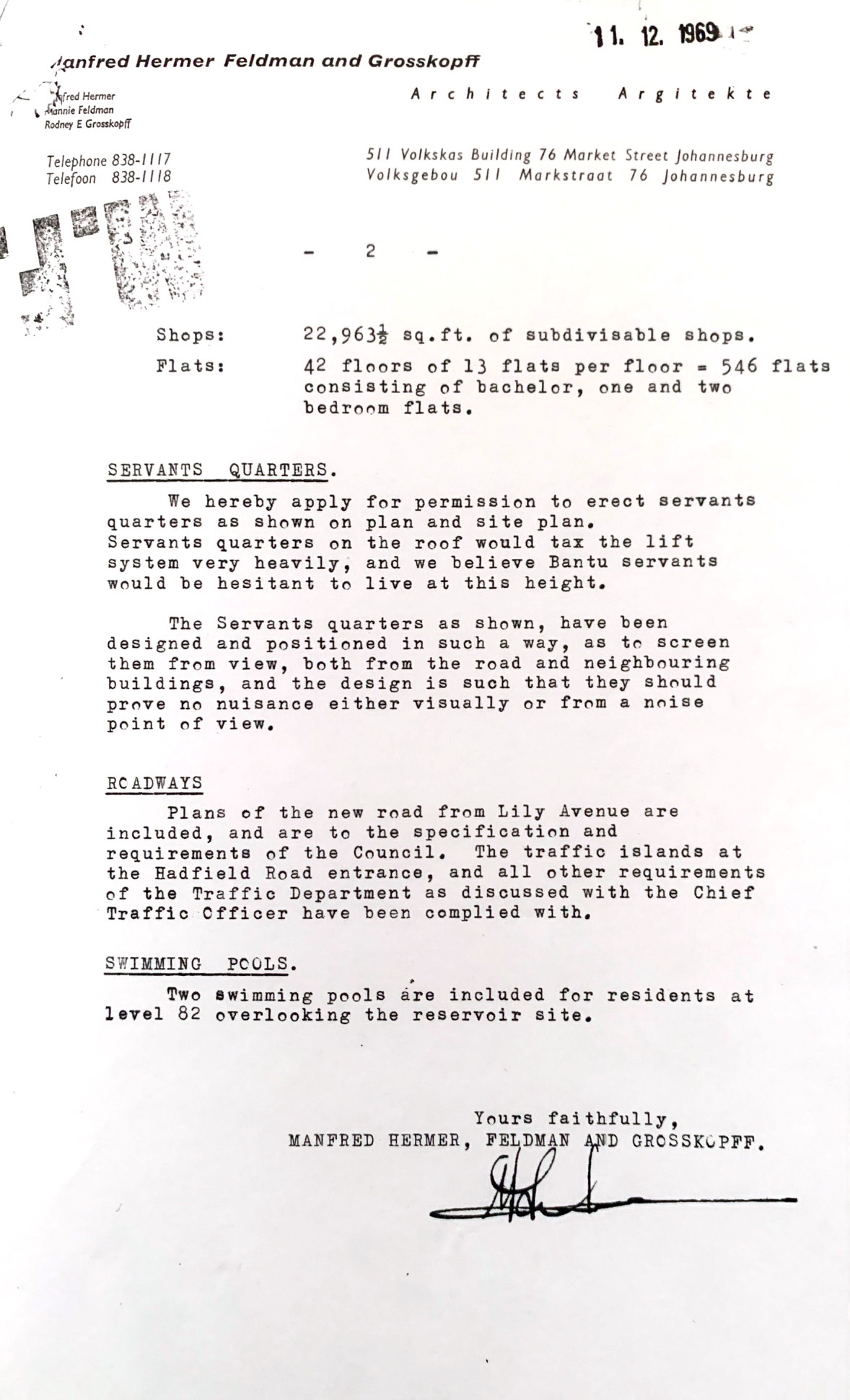
Johannesburg Department of Development Planning Archives, Johannesburg. 1969. Correspondence between Ponte City architects and Non-European Affairs Department.
In a letter sent from architects Manfred, Grosskopff, and Hermer to the Non-European Affairs Department (NEAD) on 11 December 1969, they proposed their plans as to where to place Ponte’s Black domestic workers:
‘We hereby apply for permission to erect servants quarters as shown on plan and site plan. Servants quarters on the roof would tax the lift system very heavily, and we believe Bantu ⁶ servants would be hesitant to live at this height. The Servants’ quarters as shown, have been designed and positioned in such a way, as to screen them from view, both from the road and neighbouring buildings, and the design is such that they should prove no nuisance either visually or from a noise point of view’. ⁷
Prior to the creation of the first electric lift in 1880, Black servants were often housed on the roofs of high-rise buildings. But the architects made the unusual recommendation to house servants on Ponte’s lowest residential floors. They argued that this would render Ponte’s domestic workers invisible from exterior public roads and far enough away from white tenants so that their movements would go unheard. But Director J.C. de Villiers rejected this proposal because if Black workers were to remain unnoticed and segregated from their employers, Black servants could not share the lifts with white residents. In the original plans, ‘the Bantu quarters are situated on the same floor level as the caretaker’s flat’ ⁸ —presumably someone white—which he found to be unacceptable. As a compromise, the architects proceeded to design spartan rooms at the topmost three floors for roughly 42 servants. In order to finish constructing sundecks on the roof, they circumvented the NEAD’s concerns by constructing window sills that were six feet above the ground so that Black servants could not look into the flats and sundecks of white residents.